FLLinNZ facilitation sessions – day two

Sean McDougall – speaking via videoconferencing classrooms of the futurenot a lot has changed – still sitting in classrooms altogether slumped over desks which are unsuitable for learning and sitting at all day. All studying at same time in groups. Sean has been working in designing learning spaces for the future.

No point in designing new buildings and doing the same sort of teaching there will be no additional benefits for the teachers and students. \”It is about how you do it not where you do it.\” Example of a design where the teacher could get around the students (children) better which improved the activitiy. Design of saddle seats which could swivel in any direction – take up less of a footprint – tables fit around the room – four-way data projector. Cheaper option than billions spent on school rebuilding. Room designed to encourage conversation and collaboration and teacher tried to teach by standing up the front. Learned from mistakes – need to educate teachers in new approaches.

Design my school – tool where students could be involved in designing school. http://designmyschool.net used wikipedia design – Co-Design

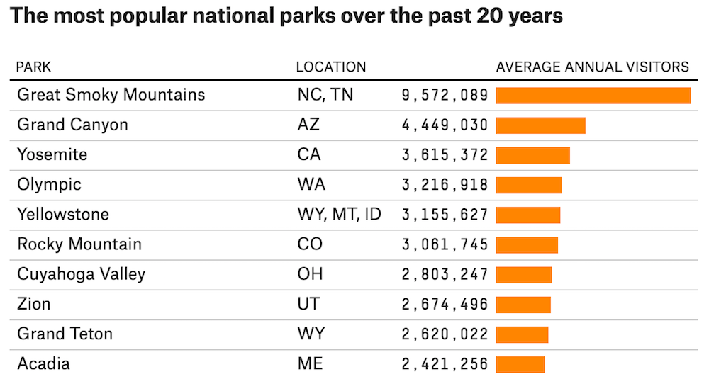
Provided some statistics about education in UK – 80% black children leave school at 16yrs and over half jobs advertised in UK in 2012 will require a degree. need to get back to the idea of a creative school rather than an \”exam factory\”. The system is not working – community minority groups illustrate this.

Singapore exampleeight years old problem-solving re bomb in an oil facility – building robots to clean up oil, building website to keep parents informed, writing business plan – a year long project. need to invent and create and solve future for themselves.

Xchurch School called Unlimited
Barriers removed – students direct their own learning Involved in projects in which they are interested e.g. designing logos, music distribution, own record label. Studying alongside 18 yr olds to get qualifications like Business.

Design done by people and with people. How can we work with excluded communities?
Example from Ireland – Sean is working with nuns in Cork. How can they work with people who are falling through groups. Responsive servicing. Immigrants, travellers, prisoners working together to find solutions to help stop people dropping out. They told their stories –
1. need place to come to meet with friends

children had different perspectives about how the building looked like – teachers forget what the rooms of the school look like.
Introduce opposites e.g. if you want technology look at what the organisation would look like without technology.

Another example-what could we do to make a fountain better? Designing a programmable, interactive fountain e.g. speed camera – measure how fast children are running around. could measure height and jets could respond to different heights. Give fountain three wishes – to see, hear, feel. Children helped design a mural with pictures and ideas of what they liked or did not like about the school. invites configuration and brings people together to work on a common problem to prepare them for the rapidly changing 21 century. create your own models and not wait for someone to \”design a catalogue and you order from it\”.

Allow people to skill up – learn and make mistakes. Video showing chidren with robots they constructed – watching them work and showing the great excitement. learning what they need for the knowledge economy. Need to redesign the service to meet the needs of the children e.g. reading construction manuals as that is where the interest lies for one of the children who likes building things.
Have moved from where things are done to them to one where people create their world. can you hand over what is seen to be important information to be displayed e.g. Cardiff streets.

1.What will it mean if we get it right?

increased success. Teachers who get it. learners who get what they want.

2.What happens if we carry on as we are?

no change as technology etc. changes around us.

3.Why haven\’t we done anything about it?

too hard, no money.

4. What could we do about it?

let people know what skills people will need in the future

Mark Nichols – institutional change for eLearning
Statement: 
now know how eLearning works – do we? We know how to facilitate online discussion – do we?
Beeby 1992 wrote about lessons learned in 1930s. Mark is an educational evolutionist. Focus is on formal education. He has failed spectacularly. Failures are far more interesting and you can learn from it. In his FLLinNZ year he read a lot about institutional change and talked to lots of people about it. Reckons it is commonsense. Has been ignored and now feels like he is prophetic. 
What do we know about change
Peter Senge – 
see institution as a whole \”see the wood for the trees\”. Large scale change is complex. Example: had a CDROm of video, looked after website, used discussion – looked after it himself and it worked well. what would happen if it was systemised? Need to train people and learners. need to copy multiple CDs. What about looking after discussions – technical support, archiving.

Who maintains resources? How do we support subject matter experts with elearning. can they use pre-prepared materials. how are new technologies incorporated? How do we enrol students? Innovation in one course is very different to what is needed in a whole programme. Good systems solve problems before they happen.

Best to work with late majority – sustainability through transformationwork on changing core ideas – workshops Core and custom – complement standardisation with innovation. How do you get buy in. Use systems that organisation has in place – systems for internal review. Meet with programme leaders and work with them. Division of labour – how to best support those who are not tech literate. Engage at level of the core with tech support at that level.
FL strategy or teacing and learning strategy – use them.

How do you go about internalising elearning?
strategic ownership – VLE a thermometer – some staff flocked to it – others ignored it. If few staff got excited good prognosis – otherwise more difficult to change ideas about eLearning.

John P. Kotter – leading organisational change, very good book.
useful orientation to major changes that are involved.

Examples from Bible College
1. establishing a sense of urgency –
 better resourcing of students, costing
Developing a strategy and PD. College eLearning audit and prepare national exemplar.
Sense of urgency varies – depends on hierarchy and priorities e.g. pbrf. When there is a crisis – lack of students for programmes. Responding to market.

2. Creating the guiding coalition
put ideas in front of managers with evidence

3.Developing a vision and strategy
what evidence is there that it improves learning? works well where there is no choice or it supports lifestyle. Don\’t change what is working and change what and when you need to.

4. Communicating the change vision

5. Empowering broad-based action

6. Generating short term wins

7. Consolidating gains and producing more change

8. Anchoring new approaches in the culture

Some discussion on the above questions but not enough time and no summarising of them at the end.

Maret Staron – TAFEOverview of some research projects. \”Designing Professional development for the Knowledge era\”.
Big emphasis in Australia with workforce development. Mentioned learning environmnet managers – work done in the workplace with learners there. Moving more to learner directed ideas. Open standards
Now in the Knowledge era – environment, learning ecology, business,
focus for all four areas on learners, context, technologies

Suggestion that the knowledge era will only last a decade – has progressed from information era. Next era proposed to be the concept era. Is this true?

Need to be knowledge workers – need to find, use information. Now need to generate our own information. One of our greatest challenges – how to work in groups to generate new knowledge?

Work is becoming more unbounded in time and space now with practitioners increasingly needing to work and engage in their own learning at work and at home\” (ANTA 2004).

Used an ecology metaphor – broader than networks – what is your learning ecology? relationship between entitities and their environment. Dynamic, adaptive and diverse – there is no one way. Maron promised a model to help but no one way.

Stuck in the mechanistic metaphor – want to think, feel, use intuition, be creative – a contradiction.

Strength-based Philosophy – moves us from deficit-based modelWhat is wrong and we will fix it. Hard to shift to strength-based model. Constrained by bureaucracies who follow the deficit-based model. A lot of organisations try and solve problems by looking at what they need to fix. Martin Seligman – how to look at what helps people thrive. How to help organisations be the best they can. Mihaly Csikszentmihalyi – psychology of optimal experience – \”in the flow\” when things work well and you are in the optimal skill level. When in the flow anxiety, boredom and apathy reduces.

Business wisdom
How to bring leadership on board. What is the glue that connects the elements of a learning organisation? (Wise thinking and actions.)

Key findings of research
Strength-based orientation more effective.
capability – moves beyond professional development – confident, capable, competence – ability to work in unknown areas.
Values is the bedrock
Disruptive model

  • action learning, mentoring is strength-based, communities of practice

Some places run events on a cafe conversation model for PD. Look at what is working and why.
Who is practising deviance in a positive way for the benefit of the organisation.
What gifts does each person bring to the organisation?
How to reshape the description of your work so it is more flexible – job sculpting.
Appreciative inquiry.
Disruptive technology – policy, research, processes
Life-based learning, expert-centred model, work-based learning
In reality learning crosses work, leisure, family etc.
What is the source of learning not the continuum? \”Learning for work is not restricted to learning at work.\”
Life-based learning is integrated and holistic. What are the enablers to create this type of learning?
\”A business approach to capability development \”- companion document to research report.

http://www.icvet.edu.au

Discussion of four questions: Modifying what could we build? – Listening, sharing stories and conversations. previous knowledge and recording.
Exploring – what assumptions should we challenge?
Visioning – what would be your ideal, your dream?
Experimenting – what can we combine and test?

What is your personal stance in relation to work-based and life-based learning? What does it it mean to design this ideal for approaches to learning?

Stanley Frielick – Real change institutional challenges and opportunitiesThreshold concepts and troublesome knowledge – a new way of understanding, interpreting or viewing something may emerge a transformed internal view of subject matter, subject landscape or world view.
What is a threshold moment? – when someone starts contributing and/or facilitating to an online discussion. When people take charge of something – self-directed learning.

The real university is a state of mind. Zen and the art of motorocycle maintenance : an inquiry. Are there two universities? The first real university is the concrete one – state of mind sits within there. What are the mental models which underly our university structures?

Teachers and learners are inextricably linked and there is not just a one-way flow of information. Reactive (teacher-centred) versus constructive (learner-centred). Both demonstrate a dualist model – autonomous model where learner is separated from the world. Ecological model – capillaries of power – an energy which circulates through an institution. (Foucalt). Need to focus on capillaries when look at change. what are the technologies of power?

threshold concept 3 – Can teaching and learning function like an ecosystem? Is it similar to indigenous models of learning? Example, dialogical model where relationships occur between teachers and learners.

Mention of DNA and genetics as shaping learning – evolution, mutants, survival of the fittest – social dynamism – who supports the weak and do we just leave them in the wilderness?

Threshold concept 4 – ecological sensibility – disruptive technologies. who decides what is knowledge? Who decided what is needed for promotion?

Real change
Form (media) and content – most disruption happening here – disruptive technologies and disruptive pedagogies.
Assessment examination and accreditation
Appraisal (teacher) and evaluation (courses)

Immune system – assessment and appraisal areas. what is needed to make this disruptive – quality, prescriptive and normative, secretive – policies and processes, rewards. Suggests real change needs to be focussed on immune system (resistance). Make them more open, networked and ecological. 

The disruptive technologies and pedagogies will act as an external stimulus which will upset the balance of the ecosystem and stimulate internal systems in assessment and appraisal i.e. disrupt them – they will have to change so they can revert to a balanced model. Change cannot occur in an ecosystem without an external stimulus. An internal stimulus can change an individual\’s system but not when an individual is part of a bigger system. Negative and positive feedback. Negative feedback in a closed system will return it to the status quo. Positive feedback will stimulate either rebirth or bleeding to death or system wide shock and collapse.

In complexity or chaos theory where there is a complex system – competency alone is not enough – it is very linear and serves only part of the purpose. Capability occurs when there is a branching out and multiple layers of action and direction.

Learning design – a definition

So far in the oldsmooc the definitions of learning design are all teacher centric because the teacher is always in charge of designing the learning. I think we probably need to throw away the established theories and the models – even though Ida has done a fabulous job of collating them on the wiki – and begin afresh using a truly learner-centric model – even the Arcs model by John Keller that Ida states is more learner-centred is teacher-led. This would mean moving to a constructivist/connectivist framework, and leaving cognitive/behaviourist approaches behind.

I think the role of teachers is to mentor and to teach critical thinking, scaffold metacognition and to guide students in how to be self-directed and self-regulated learners – our role is to guide students to develop their own strategies for learning, and to obtain and manage the information they need – access, filter, evaluate and create – and in doing so they will develop the knowledge they need to reach their learning goals. Teachers are thereby freed up from hours of designing and developing content and activities, and can support student learning more effectively through mentoring. 

Unfortunately, the spiel about learner-centred learning still occurs around curricula where the learning outcomes for courses and qualifications are set by the organisation, and teachers still set the learning objectives for each module.  Even if students already have skills and knowledge, they are often required to sit through the same stuff again, so they become bored and switch off and they disengage. Sure learning outcomes do guide the students and helps them know what they need to understand about a topic, but surely they should be the ones to decide the meaning that they need to extract from a learning experience, and what learning experiences they need to achieve their dreams?

So I am a fan of learning design whereby students take \’the reins\’ and the teacher mentors and facilitates the process. Is there a name for this type of learning design yet? Individualized learning design is a term used by Suny Empire State College.

I really like the idea of enabling students to \’pick and mix\’ the courses they want to take and decide the shape of their qualifications, so assessment of prior learning is going to be key to this, as is constructivism and connectivism as approaches to learning. I really like the individualized learning design and mentor model (with learning contracts and student-designed degrees) practised by Suny Empire State College – read more.

Learner-designed activities 
Back to the idea of learning activities designed by students for students ….Lets say for argument\’s sake that the topic they need to explore is around creating an identity on the Internet. If using individualized learning design, the students may have decided that they need to do this to up their profile for the future and to connect to others while they learn. For some many it will be more beneficial professionally to have an Internet presence. So creating an online presence and identity becomes one of their learning goals. A student might say:

  • Who do I want to be? 
  • Where will I show myself on the Internet?
  • What do I want others to see? 
  • What tools can I use to achieve this? 
  • What do I know already and what do I need to know? 
  • Who can help me with this? 

Some students will go it alone. Others will join with peers, and some may ask the teacher. From my perspective, the role of learning design is handed to the students – the teacher may support the students with questions to get them started, but the only thing the teacher might provide is guidance with the task that the students has decided to undertake, in discussion with his or her mentor (teacher): 

  • Create an identify for yourself on the Internet.
  • Share what you learn with others.

I wonder what others think? Is this a cost-effective model of learning?

What Is "Interdisciplinary Geography"? – 5 Animations To Get Kids Excited About Maps

Source: NATS


Students like geography more than most adults think. Kids are actually drawn to maps’ visual characters, their quirky variabilities, their puzzle-like natures that hold secret troves of meaning just waiting to be decoded.

For evidence, take a look at these ideas that reveal maps’ complexities:


The problem with most geography instruction is not that maps are boring; it’s that they are largely cordoned off within the confines of social studies classes. Maps, however, are by definition interdisciplinary. They unite physicality with artistry. More specifically, they combine political borders with spatial terrains. They expose slave trade routes across temporal spans. They chart celestial bodies through time and space.

Source: Business Insider


The five animations below take map visualizations a step further by adding movement to standard geography. These interactions uncloak a whole new way for students to examine the world they inhabit. Each of these explainer videos adds an unexpected interdisciplinary twist to traditional maps, making them perfect for a range of lessons.

Geography + Sociology


The video entitled “Animated Map Shows How Religion Spread Around The World” was produced by Alex Kuzoian for Business Insider. It elegantly and efficiently traces the progression of global faiths through their continental migrations. It would make an effective companion to a range of sociology, anthropology, history, and religion lessons.

Geography + Technology


London 24 from NATS on Vimeo.

This mesmerizing visualization by NATS (formerly National Air Traffic Services) is called “London 24.” It sketches the number of airplane flights over London each day. The animation is being used in the debate over expanding UK runways, to handle the 3,000 daily flights to these five metropolitan airports. It is a nifty representation of how technology, science, and global wealth have created unexpected issues for modern safety.

Geography + History


This motion graphic from Vox, entitled “220 Years Of U.S. Population Changes In One Map,” explains why the mean center of population is one of the most important and the most understudied metrics of U.S. density. The video offers unique insights into the growth of the American frontier, the expansion of states, and the effect air conditioning has had on the South’s emergence as a population powerhouse.

Geography + Science


What The Earth Would Look Like If All The Ice Melted,” from Business Insider, offers a compelling case for amping up the awareness of global climate change. Behind oddly disarming music, the animation moves its lens around the world, laying bare which major cities would be flooded if the earth’s temperature continues to rise.

Geography + Geology


Due to cartographic distortions, many people misjudge the size of the world’s landforms. This clip, also from Business Insider, is called “9 Animated Maps That Will Change The Way You See The World.” With jaunty music and cartoon graphics, the video gives a side-by-side slideshow of how the globe’s countries really stack up.

Short Essay on \’Newspaper\’ (200 Words)

\’Newspaper\’, as we know, is an essential part of our life. For a newspaper reader, it is the first and foremost thing that he would like to have early in the morning. It connects us with every field and every part of the world. Be it politics, entertainment, sports, films etc.

Newspaper provides information about the burning topics from all over world and keeps us well informed. Though news is also displayed on television and radio, there we don\’t have an option to choose. It results in wastage of time, as the news is repeated over and over again and is followed by a number of advertisements.

Apart from the information newspaper provides, it can be useful in a number of ways. The puzzles given in it develop the thinking ability. The job vacancies column help the people. A regular reader can improve his knowledge of language in which language he reads the newspaper. Newspaper also tells us about the different policies introduced by the Government and makes us aware about everything happening around us.

We can conclude by saying that the newspaper broadens our outlook and is an enormous source of information. Therefore one must develop the habit of reading newspaper everyday. 

Visualizing The National Parks – Celebrating 100 Years Of America\’s Wonder

Source: National Geographic


On August 25, 2016, the National Park Service (NPS) turns 100. After a century of shepherding America\’s splendor, the Park Service and its personnel will rightfully be feted as dedicated, humble stewards of our country\’s most precious landscapes.

Personally, we have been lucky enough to visit many of the nation\’s 59 parks on all points of the compass. Each site has never failed to live up to its consecration as a place of American rarity, pride, and beauty. From the unspoiled trails to the popular overlooks, every curated destination within the wilderness is a testament to the work and vision of the Parks Service.

Source: National Park Service


This august anniversary introduces many opportunities to weave the Parks into authentic classroom lessons. For example, the \”Every Kid In A Park\” initiative seeks to connect our nation\’s youth to its most treasured spaces. Additionally, a wide range of visualizations now provide easy ways to incorporate the centennial into state standards and skill-based curricula. At their least, these videos and graphics offer terrific kick-offs to a morning\’s discussion. At their best, these charts and illustrations support critical student proficiencies. They also bring to life the gorgeous panoply of natural wonder that would make any Disney confection blush.

To start, the \”Find Your Park\” website gathers videos and social media interactions of everyday first-person testimonials about the grandeur of America\’s vistas. As a companion, the NPS has opened its Geographic Information Systems (GIS) data to the public, for educators and graphic artists to tap in building models of terrains and visitations.

Some of the best renderings of the National Parks come from the Works Project Administration during the 1930s New Deal. These art deco posters from the Federal Arts Project capture the majesty of the otherworldly settings in colorful and appealing travel enticements. National Geographic has assembled a nice collection of these posters from the Library Of Congress.

Source: National Park Service


In a video homage, the outdoor outfitter O.A.R.S. has put together a stunning tribute to the Parks, told through the stirring words of Theodore Roosevelt. As befitting its founder, the NPS takes seriously its safeguarding of America\’s geology. It invites students of energy, minerals, and paleontology to explore the singular contours and cliffs through open online access and badging of restoration and geoscience. These resources are terrific for earth science and environmentally minded teachers to investigate with their students.

Source: FiveThirtyEight


In math and statistics, the minds at FiveThirtyEight (who usually spend their time worrying about political polls and baseball ERAs) have analyzed the popularity of each park. They crafted crisp graphs and charts for STEM educators to draw from in ranking the visitors to each venerated location. As they note, \”the U.S. national parks have never been so popular,\” and the Great Smoky Mountains continues its reign as the most-visited National Park, due to its location and exquisiteness.

Source: FiveThirtyEight


In probing the specifics beneath the Great Smoky Mountains\’ charm, researcher John Farrell raked the Instagram API to determine where in the Park photographs were most frequently snapped. His visualization layers social media atop traditional coordinate geography to present a new picture of the Park\’s usage. He includes similar map mash-ups for other coast-to-coast sites.

Source: John Farrell


For its part, the NPS has put together its own retro advertisement, in the classic style of antique movie reels or 1950s television ads. This wry film is a perfect nod to the 100-year heritage of the organization. It also displays a warm embrace of every citizen who passes through the Parks\’ gates.


Digging deeper into the soil and flora, Luke Easterwood, Michael Gelon, Hadar Scharff, and Matt Soave have analyzed the Parks\’ Vegetation Inventory. They built a visualization series to \”encourage insightful discoveries\” through the Tableau interface. These charts and graphs drill down to specific physiognomic classes and leaf phenology details.

Source: mattsoave.com


In order to help navigate the Parks, the Sierra Club has designed a System Map based on the urban subway template. This seemingly humorous rendering actually gives travelers a valuable guide in planning their vacations and in connecting the dots between regional marvels.

Source: Fast Company


Source: David Hockney

Finally, the purest representations of America\’s National Parks have always come from the minds of the country\’s painters. Beginning with the light portraits of Thomas Moran, many artists have sought to capture the glory of glaciers and geysers. Most recently, David Hockney scratched a series of brilliant sweeps on his iPad in his \”Yosemite Suite.\” These personal, stylized views prove to any viewer that the nation\’s Parks are love letters to its wilderness. They are the last vestige against urbanity and a hallmark of global distinction.