

 |
| Source: NATS |
Students like geography more than most adults think. Kids are actually drawn to maps’ visual characters, their quirky variabilities, their puzzle-like natures that hold secret troves of meaning just waiting to be decoded.
For evidence, take a look at these ideas that reveal maps’ complexities:
- Digital Empathy: How Modern Maps Are Charting A Personal Cartography
- Geography Is Having A Moment – Why Maps Are The New Meme
- Rethinking Global Education – Maps As Social Media
- The Visual Politics Of Cartography
The problem with most geography instruction is not that maps are boring; it’s that they are largely cordoned off within the confines of social studies classes. Maps, however, are by definition interdisciplinary. They unite physicality with artistry. More specifically, they combine political borders with spatial terrains. They expose slave trade routes across temporal spans. They chart celestial bodies through time and space.
 |
| Source: Business Insider |
The five animations below take map visualizations a step further by adding movement to standard geography. These interactions uncloak a whole new way for students to examine the world they inhabit. Each of these explainer videos adds an unexpected interdisciplinary twist to traditional maps, making them perfect for a range of lessons.
Geography + Sociology
The video entitled “Animated Map Shows How Religion Spread Around The World” was produced by Alex Kuzoian for Business Insider. It elegantly and efficiently traces the progression of global faiths through their continental migrations. It would make an effective companion to a range of sociology, anthropology, history, and religion lessons.
Geography + Technology
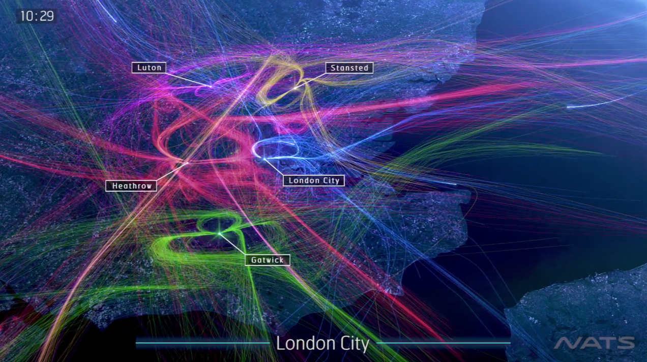
London 24 from NATS on Vimeo.
This mesmerizing visualization by NATS (formerly National Air Traffic Services) is called “London 24.” It sketches the number of airplane flights over London each day. The animation is being used in the debate over expanding UK runways, to handle the 3,000 daily flights to these five metropolitan airports. It is a nifty representation of how technology, science, and global wealth have created unexpected issues for modern safety.
Geography + History
This motion graphic from Vox, entitled “220 Years Of U.S. Population Changes In One Map,” explains why the mean center of population is one of the most important and the most understudied metrics of U.S. density. The video offers unique insights into the growth of the American frontier, the expansion of states, and the effect air conditioning has had on the South’s emergence as a population powerhouse.
Geography + Science
“What The Earth Would Look Like If All The Ice Melted,” from Business Insider, offers a compelling case for amping up the awareness of global climate change. Behind oddly disarming music, the animation moves its lens around the world, laying bare which major cities would be flooded if the earth’s temperature continues to rise.
Geography + Geology
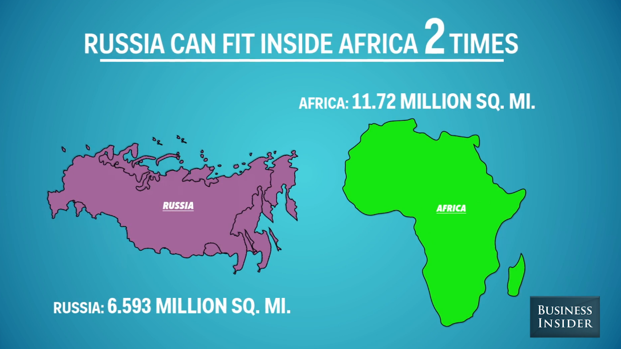
Due to cartographic distortions, many people misjudge the size of the world’s landforms. This clip, also from Business Insider, is called “9 Animated Maps That Will Change The Way You See The World.” With jaunty music and cartoon graphics, the video gives a side-by-side slideshow of how the globe’s countries really stack up.


You must be logged in to post a comment.