
Data visualization helps to understand large chunks of data with pictorial representation. R is an amazing tool for data visualization. R provides a wide range of charts for data visualizing data. R is a language that is designed for computing statistical problems, graphical data analysis, and scientific research.

Basic charts for visualization we shall discuss :
- Bar Plot
- Histogram
- Scatter Plot
- Box Plot
- Line Chart
Bar plot
Barplot is used to visualize the relative or absolute frequencies of observed values of a variable. The frequency of the observation is the count of that observation in the data. They are used for continuous and categorical variable plotting.
#Lets suppose we have a monthly sales data
sales <- c(120,123,117,130,110,80,130,112,120,111,125,140)
barplot(sales,main = "Monthly sales",xlab = "Month",ylab="sales",
  names.arg = c("Jan","Feb","Mar","Apr","May","Jun","July",
                "Aug","Sept","Oct","Nov","Dec"),col="green")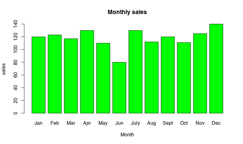
barplot(sales,main = "Monthly sales",xlab = "Month",ylab="sales",
  names.arg = c("Jan","Feb","Mar","Apr","May","Jun","July",
                "Aug","Sept","Oct","Nov","Dec"),col="green",horiz = TRUE)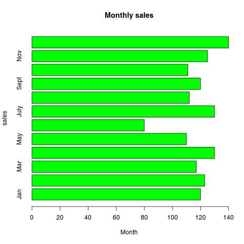
Histogram
The histogram is used for data that is classified into different groups. The histogram has a similar appearance to the vertical bar chart but there are no gaps between the bars.
Generally, it is used to display the distribution of numerical variables.
salary <- c(120,123,117,130,110,98,80,130,112,120,89,111,130,125,140)
hist(salary,col="light blue",border = "blue",main ="Histogram of Salary")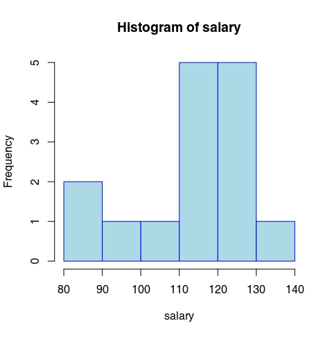
Scatter Plot
A scatter plot is used to identify relationships between two numerical variables. Each dot represents a pair of observations (x,y). They are commonly used to find correlational relationships between variables.
x = c(6,13,9,17,12,8,11,18,5,12,7,9,7,17,14,9,8,10,3,12)
y = c(15,8,11,12,10,15,11,10,8,14,11,13,10,9,10,12,13,12,10,10)
plot(x,y,main = "Scatter plot",col="blue",pch=19,frame=F)
Another way of making a scatterplot using the “‘car” package:
library(car)
x = c(6,13,9,17,12,8,11,18,5,12,7,9,7,17,14,9,8,10,3,12)
y = c(15,8,11,12,10,15,11,10,8,14,11,13,10,9,10,12,13,12,10,10)
scatterplot(x~y)
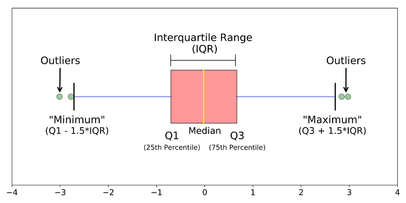
Boxplot
Boxplot is very useful in finding outliers in the data. Boxplot gives you a good representation of quartiles, mean, median, skewness, and spread of the data. Underlying distribution can be identified using a boxplot.
# boxplot() to create a boxplot for ozone in airquality dataframe.
# Ozone  : int  41 36 12 18 NA 28 23 19 8 NA ...
df = airquality
boxplot(df$Ozone)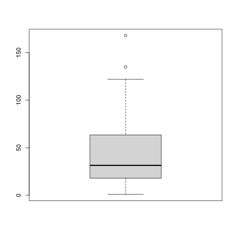
# Notch can be added by setting the notch parameter "notch = TRUE"
# Alignment can be change by setting horizantal parameter
boxplot(df$Ozone,main="Mean ozone",xlab="Parts per billion",ylab="ozone",col="yellow",
        border="brown",notch = TRUE,horizontal = TRUE)
Line Chart
A line chart is a type of chart that represents information in a series of data points connected by a straight line segment. It is used to show a change in continuous variables over a time span. It is widely used for sales, share price analysis, weather recordings, etc.
#Simple Line chart
a = c(119,119,110,112,114,113,118,109,130,136)
plot(a,col="red",type="l",main = "Simple Line chart")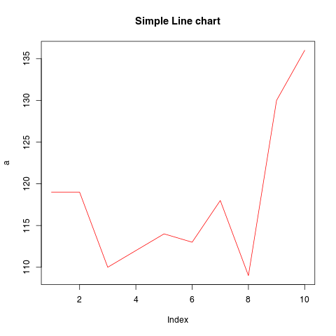
# Multiple Lines Chart
a = c(119,119,110,112,114,113,118,109,130,136)
b = c(132,126,113,115,120,111,136,121,122,116)
plot(a,col="red",type="l",main = "Multiple Line chart")
lines(b,col="blue")
legend(2,135,legend=c("a","b"),col=c("red","blue"),lty = 1,cex=0.8)
These are few of the many charts used in data analysis. R provides more than 400 different charts for data visualization.To explore more such blogs about data visualization follow us at EDUINDEX.

You must be logged in to post a comment.