
What is a logo? In simple words it is a face of a company. They have to work at tiny sizes, and huge. There are four specific types.
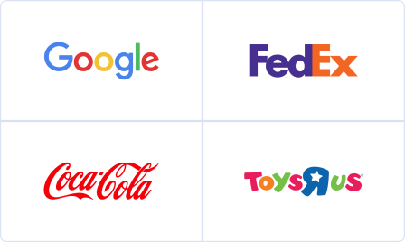
First type is the Wordmark. “the wordmark is the easiest one. And it’s the one we’re all the most familiar with. I mean John Hancock’s signature is quite a word mark. It can look crisp clean and modern just like the new Google logo looks. Or it can look somehow that it’s roots during a shared heritage the way the Coca Cola logo looks.
The second is PICTORAL. “Pictoral logos often function as a sort of rebus. It’s a picture, and it’s identifying the name of the company. Sometimes directly like Target. Sometimes indirectly like LaCoste.
![]()
The third kind is kind of the holy grail. As a designer people will come to me and they’ll say i would like something just like the Nike. They think the Nike swoosh was the Nike Swoosh the day it had been drawn. But it had been nothing the day it had been drawn.” the corporate that birthed nike commissioned a design student named Carolyn to draw some ideas. The Nike founders didn’t really like it, it wasn’t an overnight success. Then they started putting it on the sides of shoes. The shoes were good then the genius of Nike’s marketing apparatus made us further associate that product not merely with performance athletic gear but with the very idea of athletic achievement itself. That’s exactly how religious symbols work – it’s obviously not just anything inherent in about these shapes, but what these shapes have come to represent within the minds of the people who are looking at them.
Fourth sort of logo that goes beyond these three types, and may use elements of every of them: the brand System. A kind of framework, but one which will have endless permutations. The first huge, popular example of the brand system would be MTV. But google’s daily “doodles” are another great example the brand system – a well-known mark that can also point to other ideas and issues. This approach all has got to do with technological change. It wont to be if a corporation was doing a logo there’d be this operation by which it might be inscribed on all their equipment and on their airplanes and their retail facilities and gold pins and cufflinks would be made for the chief suite and placed on spitoons in ashtrays, the highest of the skyscraper, and everyone’s business card. Nowadays none of that’s important as an email signature or your twitter avatar or the small thing that sits next to your URL.

The logo really reminds people that’s what our priority is today but at the top of the day, no matter the form , style or system, it’d not matter what the logo is. It really is about thinking of those symbols as being empty vessels during a way. And then you pour the meaning into them. Some vessels are better at holding one quite meaning. They think they’re judging a diving competition, but actually of these organizations are in swimming competitions. It’s not what quite splash you create once you hit the water. It’s about how long you’ll keep your head above that water. Logos got to have an extended life, not win points during a discussion. 12 years after the birth of the nike logo, Nike came back thereto graphic design student Carolyn with a present a Nike ring together with her own trademark on it with an undisclosed amount of Nike stock.
